The Devils
HELPING MANCHESTER UNITED TAKE THEIR FIRST GROUND BREAKING STEP INTO THE WORLD OF WEB3.
ContributionCreative Direction Graphic Design Illustration Brand Design Visual Design UI Design
about this
project
CHALLENGE
Manchester United wanted to take a bold step into community building, supported by digital innovation, yet it faced a challenge of exploring a new space.
I came in as the first hire in the Digital Innovation department, bringing knowledge and expertise as an active member of the Web3 and NFT community, combined with my experience in Graphic Design, Branding and Animation.
The aim was to create Man U’s first project that would help them launch into the space.
APPROACH
We created a bold first launch that appealed both to fans new to the world of digital collectibles and Web3 natives.
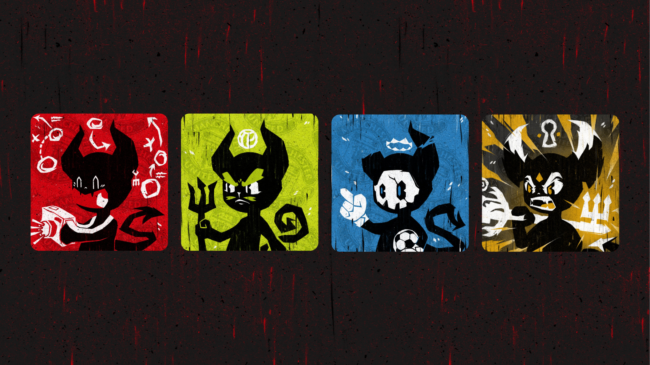
As the Lead Designer & Illustrator I designed a key character, somewhat inspired by Fred the Red, infused with Manchester United lore and history, drawing from the nickname the club is known by, ‘ The Red Devils’. I also designed custom typography for the project, lots of external communications and led on creative direction and feedback for the website UI designs and larger external advertising campaigns.
We developed a distinct visual style that not only looks gritty, energetic and powerful, appealing to our young male dominated audience, but also can still sit under the bigger Man U brand umbrella and be flexibly translated into a variety of brand and design applications.
The Devils style is unique, but borrows some brand sensibilities from the Man U brand itself, making sure it feels like it sits under the bigger Man U brand umbrella. Yet it has distinct characteristics and a unique visual language.
The logo is developed to look devilish, with a hint of rock’n’roll rebelliousness. The brand uses heavy texture throughout, aiming to make the artwork and the brand look burnt by the flames of hell, where the devils live.
Working on the gateway into the world of ‘The Devils’, I worked on ‘The Key’ token that would unlock the possibility of buying one of ‘The Devils’ tokens later. Each key corresponded with a rarity tier, building hype and enabling people to have early access to the collection.
The keys were animated in a stop motion like style, bringing the texture and the flame like elements to life, furthering the look and feel of the keys being on fire.
In the background you can see the silhouette of the devils horns, an easter egg placed to further drive discussion on what the collection will look like.
This is a first in sports NFT’s and possibly a first in NFT’s in general for PFP character’s. All Devil traits correspond to a defined sentiment score (Plus, Neutral, Minus) and only combine with other traits of that score.
This means we were able to express both happy and sad emotions in one single generative collection without having mismatched expressions, such as a crying Devil face with a cheering body.
DEVILS NEUE TYPEFACE
Taking Manchester United brand font - Bebas Neue, I created a custom version of it for ‘The Devils’ campaign to be used across a variety of comms and design touchpoints.
It makes this project sit in the core Manchester United brand family, but gives it it’s own unique voice.
Working on custom typography for ‘The Devils’ collection, I wanted to use the textured aesthetic and infuse it with sharp, flame like details, complimenting the illustration style and making it look and feel almost rock’n’roll, an expression the mischievous visual language.
I used the same principles to design stickers to be used by the Discord community, driving further community engagement. They also ended up being printed and placed all around Old Trafford Stadium during project launch.
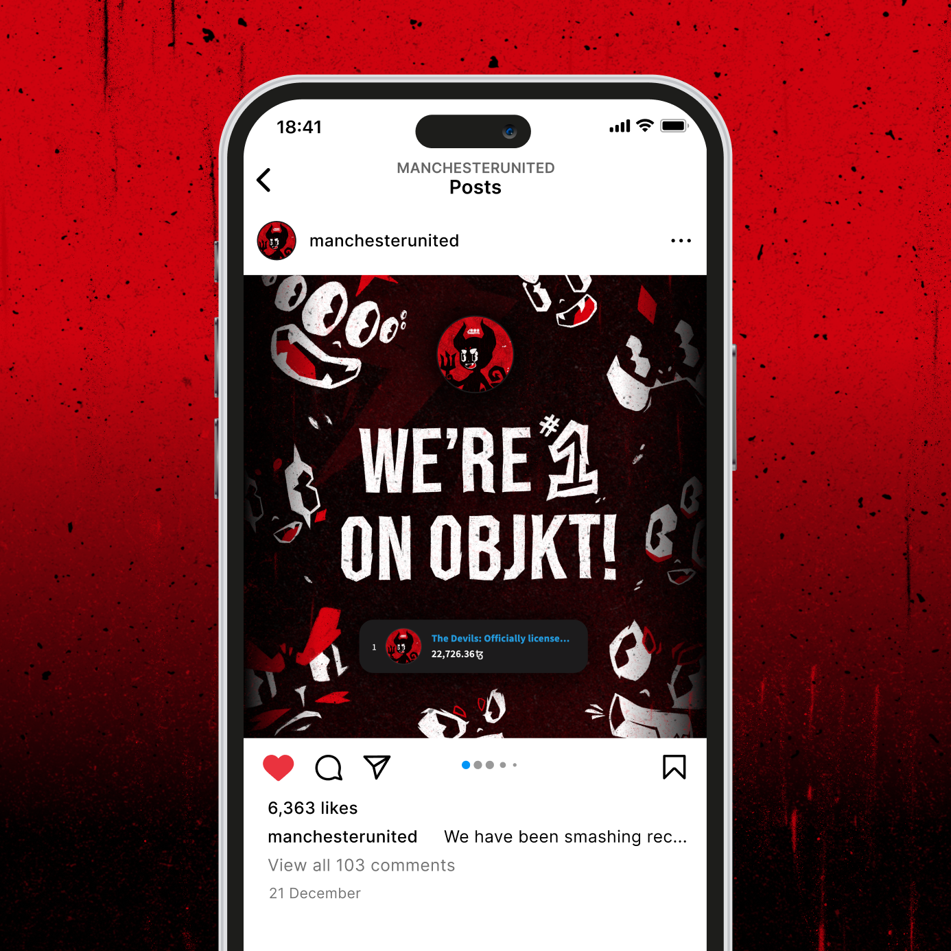
This project was incredibly successful, setting up a solid foundation for the community building venture, resulting in Manchester United growing the largest Discord community in all of football with over 93,000 members.
’The Devils’ launch was so successful that we had over 80,000 keys claimed and all 7,777 Devils were sold out within days.


